Quick answer: LinkedIn has no built-in bold button for posts — so you can't bold text the way you would in Word. The trick is Unicode characters: letters that look bold but are technically different symbols, which LinkedIn happily displays. The fastest way is a free formatter: type your text, click Bold, copy, and paste it into LinkedIn. Below are three ways to do it, plus the mistakes that quietly hurt your reach.
Why LinkedIn Doesn't Have a Bold Button
Hey, I'm Salman — I build websites and tools for a living, including a free LinkedIn text formatter that thousands of people use for exactly this problem. Here's the thing most guides skip: LinkedIn posts are plain text. There's no rich-text editor, no formatting toolbar, no Ctrl+B. If you paste bold text from Word or Google Docs, LinkedIn strips the formatting and you get plain letters.
What does work is Unicode. The Unicode standard includes "Mathematical Alphanumeric Symbols" — full alphabets that look bold, italic, or script, but are separate characters (𝗮 isn't the letter a with styling; it's a different symbol entirely). LinkedIn renders them just like any character, so your post displays "bold" text without LinkedIn's editor being involved at all. Every method below is just a different way of producing those characters.
Method 1: Use a Free LinkedIn Text Formatter (Fastest)
The no-thinking-required option — and yes, this is the tool I built, so I'll show you exactly how it works:
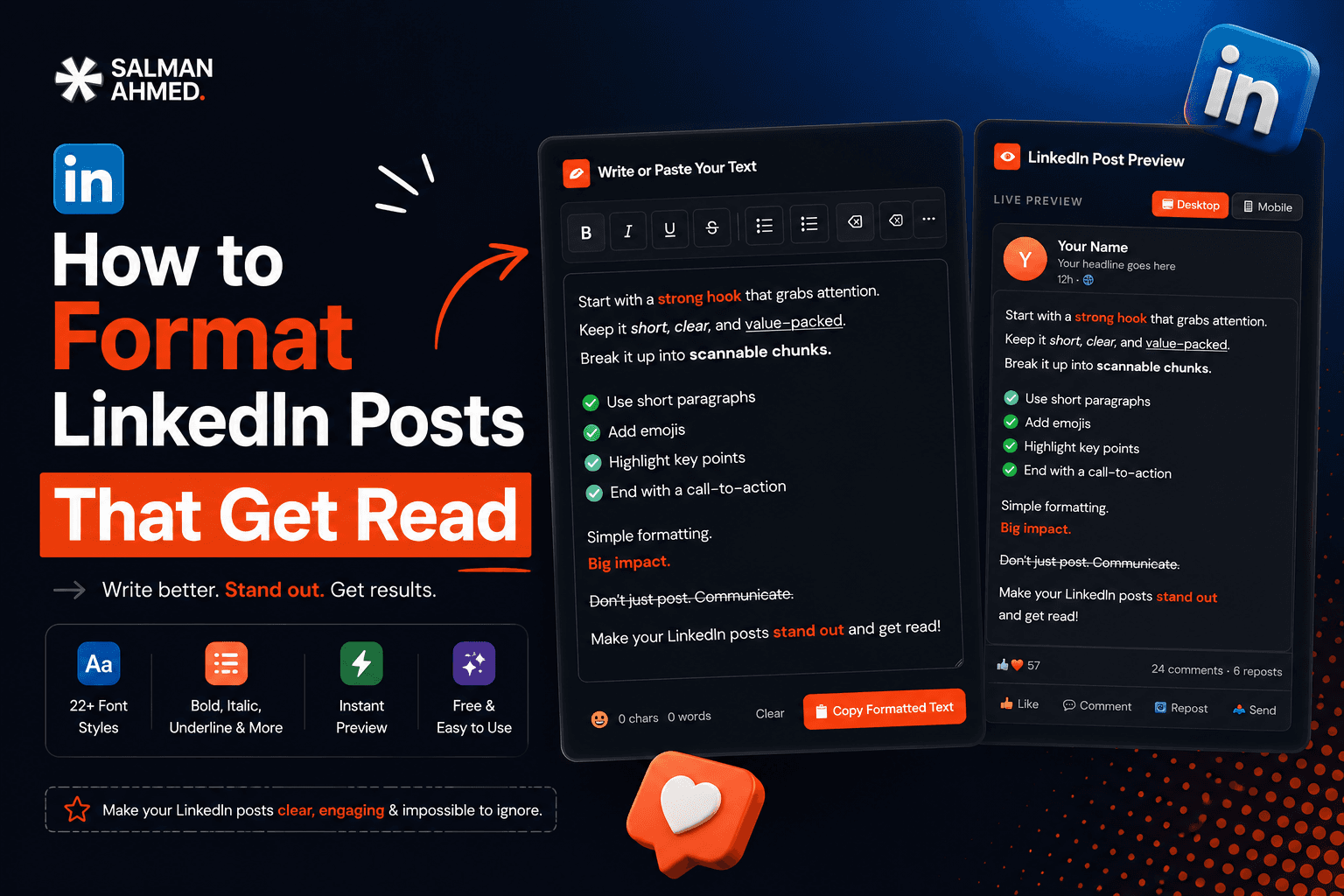
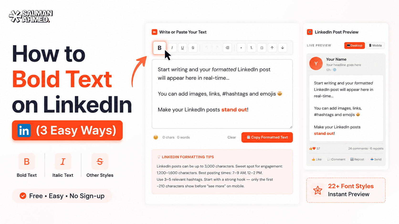
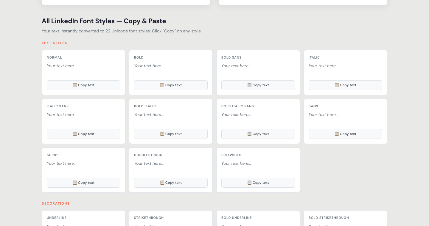
- Open the formatter — my LinkedIn Text Formatter is free, runs in your browser, and needs no sign-up.
- Type or paste your post into the editor.
- Select the words you want bold and click the B button — you'll see the change instantly in a live LinkedIn-style preview, so you know exactly how the post will look in the feed.
- Click "Copy Formatted Text" and paste it into LinkedIn. Done.
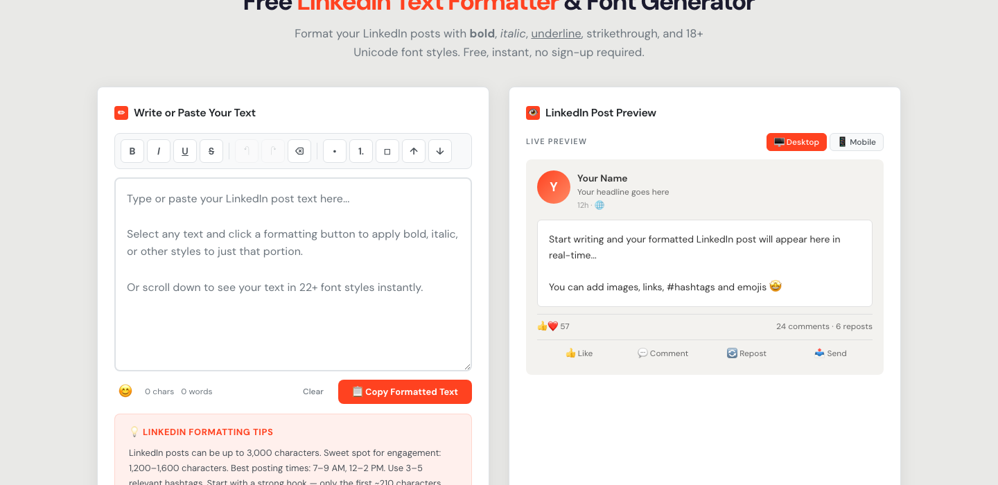
The same editor does italic, underline, strikethrough, and 20+ Unicode font styles — and there's a copy-paste style library under the editor if you just want to grab a style directly:
It works for posts, comments, your headline, and your About section — anywhere LinkedIn accepts text.
Method 2: Copy Unicode Bold Characters Manually
No tool at all: you can copy bold Unicode letters from a character reference (search "Mathematical Alphanumeric Symbols") and build words letter by letter. For example: 𝗕𝗼𝗹𝗱 𝘁𝗲𝘅𝘁 𝗹𝗼𝗼𝗸𝘀 𝗹𝗶𝗸𝗲 𝘁𝗵𝗶𝘀. It's the same end result as Method 1 — just assembled by hand. Honestly, nobody does this for more than one word; it's slow and easy to mistype. But it's useful to understand, because it proves the point: there's no magic, just different characters.
Method 3: Why Word & Google Docs DON'T Work
The most common failed attempt: write the post in Word or Docs, bold the text there, and paste it into LinkedIn. The formatting vanishes. That's because Word's bold is styling applied to normal letters — and LinkedIn strips styling on paste. Unicode bold survives because the "styling" is baked into the characters themselves. So skip the detour: format for LinkedIn with a Unicode-based tool, not a word processor.
Does Bold Text Actually Improve Engagement?
Used well, yes — bold text stops the scroll. LinkedIn's feed is a wall of identical grey text; a bolded hook line or a few emphasized phrases give the eye something to anchor on. The people I see using it best follow the same pattern: a bold opening hook, bold for the two or three phrases that carry the post, and plain text for everything else.
Used badly, it backfires. A fully-bolded post reads like shouting, looks like spam, and — more importantly — has real technical downsides:
- Unicode text isn't searchable. LinkedIn's search doesn't index those characters as normal words — so never put your name, job title, or keywords you want to be found for in Unicode styling. Keep those plain.
- Screen readers struggle with it. Some assistive tech reads Unicode letters character-by-character or skips them. Keep styled text to short emphasis, never whole paragraphs.
- Some devices render styles differently. The core bold set is safe almost everywhere, but exotic styles can show as boxes on older devices. Preview before posting — that's exactly why my formatter shows a live feed preview.
Best Practices for Bold Text on LinkedIn
- Bold your hook line — the first sentence that decides whether anyone clicks "see more".
- Emphasize 2–3 key phrases per post, not whole paragraphs.
- Keep names, job titles, and keywords plain so search can find them.
- Use section-style bold lines instead of headers in long posts — LinkedIn has no H2s, bold lines do that job.
- Always preview — what looks clean in an editor can feel heavy in the feed.