
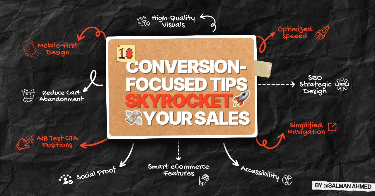

Turn Your Website into a Sales Powerhouse
Is your website failing to convert visitors into customers? A poorly optimized site can cost small businesses thousands in lost sales. In 2025, web design tips for small business success focus on Conversion Rate Optimization (CRO) to drive revenue. As a Web Designer and WordPress Developer with over 100 websites built for eCommerce and local services, I’ve helped clients like Second Sole achieve a 50% conversion boost, generating $10,000 in sales in just 6 months. This guide shares 10 actionable website conversion tips to skyrocket your sales, from strategic CTAs to trust-building UX tweaks. Plus, download my Free Small Business Website Checklist to optimize your site today. Ready to boost conversions? Let’s dive in!
Why Conversion-Focused Web Design Matters
A website optimized for conversions isn’t just a digital presence—it’s a sales machine. Here’s why sales-focused website tips are critical in 2025:
- Higher Conversions: Optimized designs can boost conversions by 200% (Forrester).
- Customer Trust: 88% of users trust sites with professional UX (BrightLocal).
- Lower Bounce Rates: Clear navigation and CTAs keep visitors engaged.
- Revenue Growth: Second Sole’s eCommerce site saw a 50% conversion increase with CRO.
Want to turn clicks into sales? Explore my Landing Page Design services for CRO-driven solutions!
10 Conversion-Focused Web Design Tips to Increase Sales
These web design tips for small business focus on CRO and UX to maximize sales, with real-world examples from my projects.
1. Optimize CTA Button Colors for More Clicks
The color of your call-to-action (CTA) buttons can significantly impact click-through rates.
- Why It Matters: Contrasting colors (e.g., red or orange) increase clicks by 21% (HubSpot).
- Actionable Steps:
- Use bold colors like red or orange against neutral backgrounds.
- Ensure buttons are large (48x48px) and tappable on mobile.
- Test colors with A/B tools like Google Optimize.
- Place CTAs in high-visibility areas (e.g., above the fold).
- Example: Second Sole’s “Shop Now” button in orange boosted clicks by 25%.
- Pro Tip: Experiment with 2–3 color variations to find the best performer.
2. Place Trust Badges Strategically
Trust badges (e.g., SSL, payment icons) reassure users, reducing hesitation at checkout.
- Why It Matters: 61% of users avoid purchases without trust signals (Baymard).
- Actionable Steps:
- Add badges near checkout or CTAs (e.g., “Secure Checkout”).
- Use recognized icons (PayPal, Visa, Norton Secured).
- Highlight customer reviews or testimonials nearby.
- Ensure badges are visible on mobile.
- Example: Second Sole’s trust badges near the checkout reduced cart abandonment by 15%.
- Pro Tip: Combine badges with a “Money-Back Guarantee” for extra trust.
3. Reduce Cart Abandonment with UX Tweaks
A seamless checkout process is key to design to increase sales, especially for eCommerce.
- Why It Matters: 67% of shoppers abandon carts due to poor UX (Baymard).
- Actionable Steps:
- Simplify checkout to 1–2 steps.
- Offer guest checkout options.
- Display progress bars (e.g., “Step 1: Shipping”).
- Use autofill for forms to speed up entry.
- Example: Second Sole’s streamlined checkout cut abandonment by 20%.
- Pro Tip: Test checkout flow with real users to identify friction points.
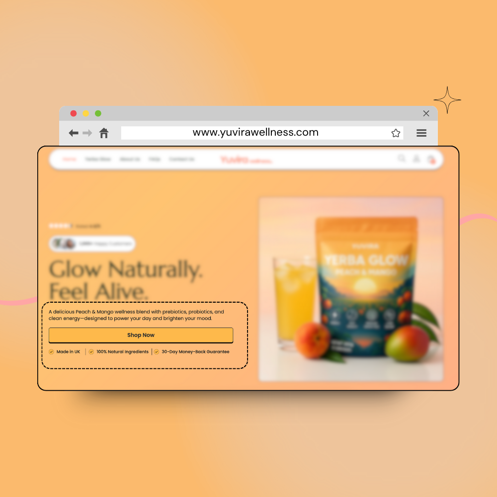
4. A/B Test CTA Positions for Higher Conversions
Testing CTA placement ensures you maximize clicks and conversions.
- Why It Matters: Strategic CTA placement can boost conversions by 121% (HubSpot).
- Actionable Steps:
- Test CTAs above the fold vs. mid-page.
- Use heatmaps (e.g., Hotjar) to track clicks.
- Include multiple CTAs per page (e.g., header, footer).
- Use action-oriented text (e.g., “Buy Now” vs. “Learn More”).
- Example: Yuvira Wellness’s above-the-fold CTA increased purchases by 30%.
5. Simplify Navigation for Quick Conversions
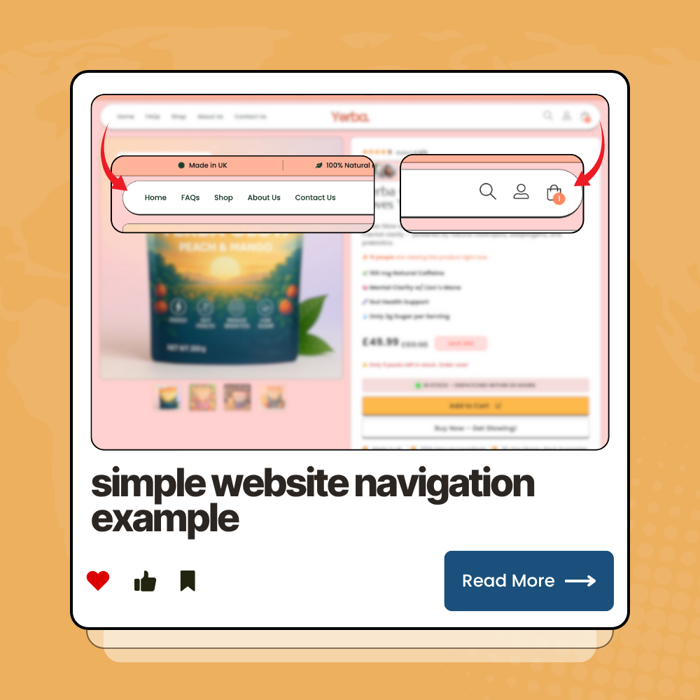
Clear navigation guides users to purchase faster, a top website conversion tip.
- Why It Matters: 70% of users leave sites with confusing menus (HubSpot).
- Actionable Steps:
- Limit menu items to 5–7 (e.g., “Home,” “Shop,” “Contact”).
- Use descriptive labels (e.g., “Order Now”).
- Add a search bar for product discovery.
- Keep menus sticky for accessibility.
- Example: Yuvira Wellness’s simple menu increased session duration by 20%.
6. Use High-Impact Visuals to Drive Sales
Compelling visuals grab attention and encourage purchases.
- Why It Matters: Custom visuals boost engagement by 30% (Adobe).
- Actionable Steps:
- Use high-resolution product images, not generic stock photos.
- Add zoom functionality for product details.
- Include short videos (e.g., 15-second product demos).
- Optimize images with WebP format for speed.
- Example: Second Sole’s product photos increased add-to-cart rates by 25%.
- Pro Tip: Use consistent branding in visuals to build trust.
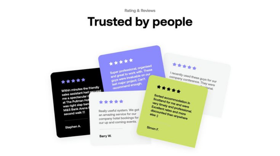
7. Add Social Proof with Customer Reviews
Reviews are a powerful sales-focused website tip to build credibility.
- Why It Matters: 88% of consumers trust reviews as much as recommendations (BrightLocal).
- Actionable Steps:
- Integrate a review system like Yotpo or Judge.me.
- Display 4–5 star reviews near CTAs or checkout.
- Highlight specific feedback (e.g., “Fast delivery!”).
- Update reviews regularly for freshness.
- Example: Second Sole’s Yotpo reviews boosted trust, contributing to a 50% conversion increase.
8. Optimize for Mobile Conversions
Mobile-friendly design is critical for web design tips for small business success.
- Why It Matters: 53% of users abandon slow mobile sites (Google).
- Actionable Steps:
- Use responsive layouts with Elementor.
- Ensure buttons are tappable (48x48px).
- Optimize images for fast mobile loading.
- Test with Google’s Mobile-Friendly Test.
- Example: Second Sole’s mobile-optimized site drove 40% of sales from smartphones.
- Pro Tip: Prioritize mobile UX for eCommerce shoppers.
9. Streamline Forms for Lead Capture
Simple forms boost sign-ups and inquiries, a key design to increase sales.
- Why It Matters: 50% of users abandon complex forms (Formstack).
- Actionable Steps:
- Limit form fields to 2–3 (e.g., name, email).
- Use clear labels and placeholder text.
- Add a strong CTA (e.g., “Get My Free Checklist”).
- Test form placement (e.g., pop-up vs. inline).
- Example: Second Sole’s simplified contact form increased inquiries by 15%.
- Pro Tip: Use Klaviyo for flyout forms to capture leads seamlessly.
10. Track Performance with Analytics
Analytics reveal what drives conversions, making it a must-have website conversion tip.
- Why It Matters: Data-driven tweaks can improve ROI significantly.
- Actionable Steps:
- Install Google Analytics to track conversions.
- Monitor bounce rates, session duration, and click-throughs.
- Use heatmaps to analyze user behavior.
- Adjust CTAs or visuals based on insights.
- Example: Second Sole’s analytics showed a 60% traffic boost, guiding CRO improvements.
- Pro Tip: Set up conversion goals to measure sales and leads.
Top 5 Conversion-Focused Web Design Tips:
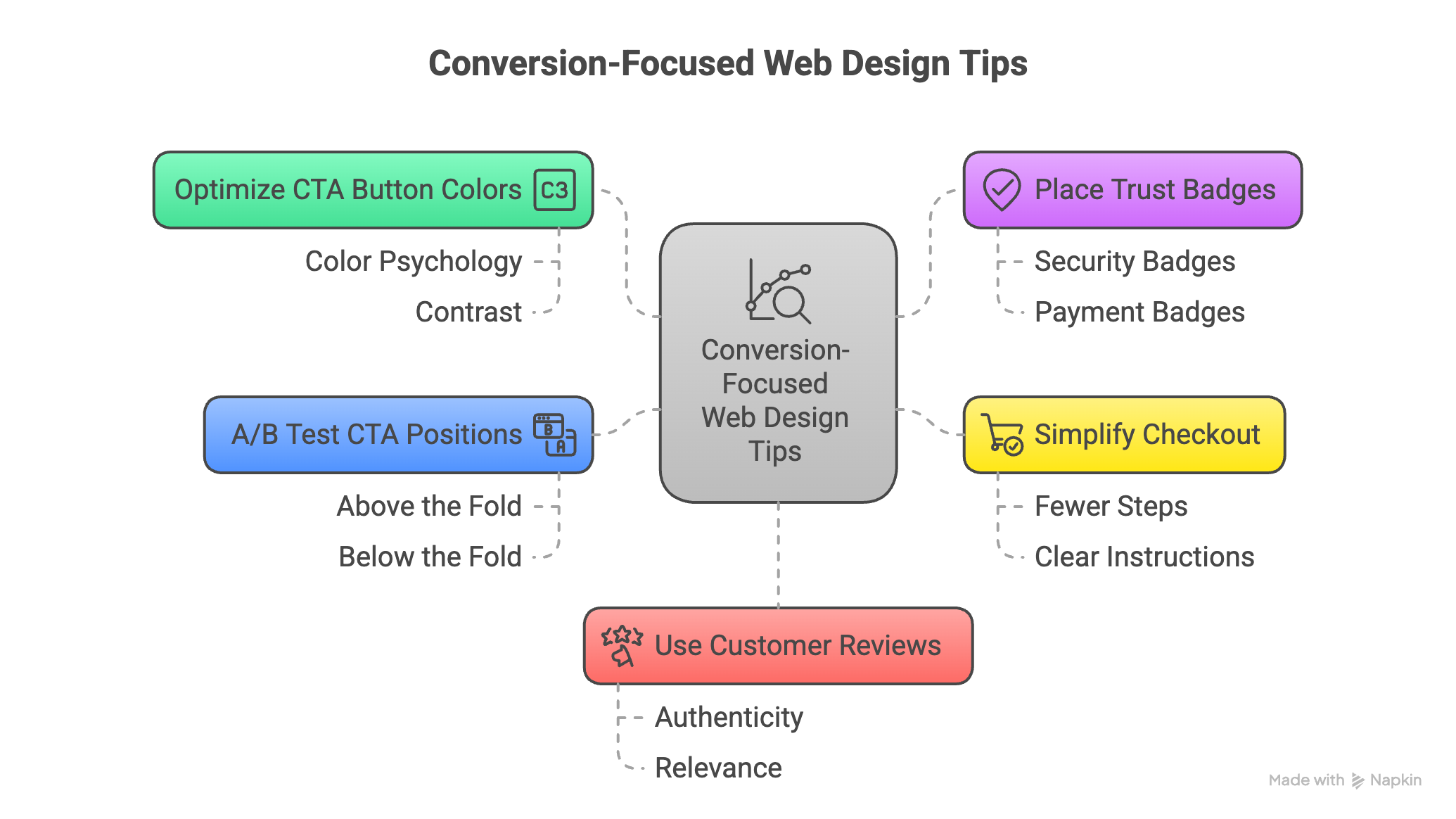
These tips are your shortcut to higher sales in 2025:
- Optimize CTA button colors for clicks.
- Place trust badges near checkout.
- Simplify checkout to reduce abandonment.
- A/B test CTA positions for conversions.
- Use customer reviews for trust.
Ready to boost sales? Contact Salman!
Client Success Story: Second Sole
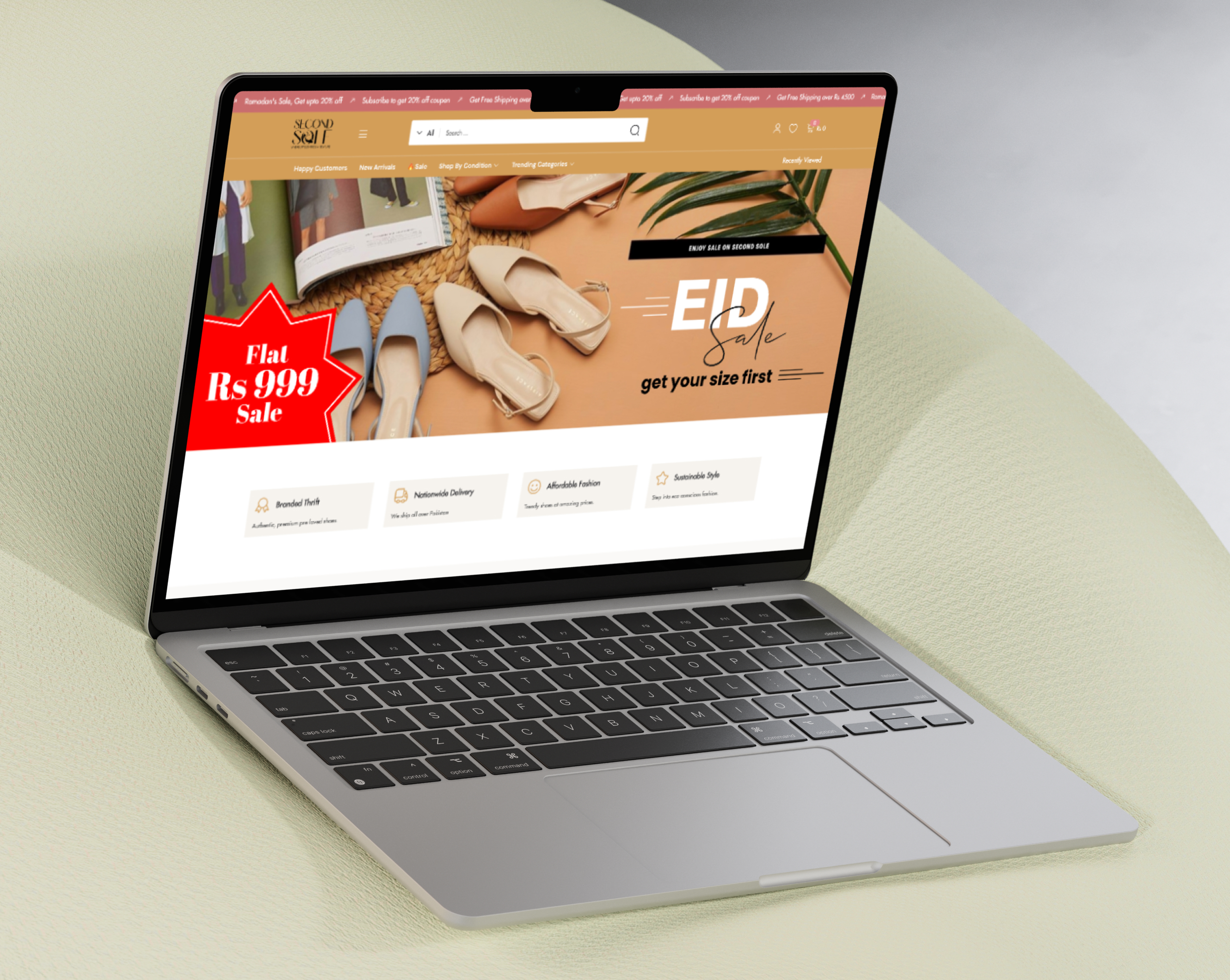
Second Sole, a women’s thrift shoe store, had no online presence. I built a WordPress eCommerce site using WooCommerce, Yotpo reviews, and Mailchimp integration. The result? A 50% conversion increase, 60% traffic boost, and $10,000 in sales in 6 months. Key CRO features included a streamlined checkout, trust badges, and mobile optimization. See more success stories in my portfolio!
Common Conversion Killers to Avoid
Avoid these pitfalls to maximize your design to increase sales:
🛒 Complex Checkout: Simplify to 1–2 steps.
🔒 No Trust Signals: Add badges and reviews.
📱 Slow Mobile Site: Optimize for <3-second loads.
👉🏼 Vague CTAs: Use bold, action-oriented text.
🎨 Cluttered Design: Embrace white space for clarity.
Fix these issues with a free website audit!