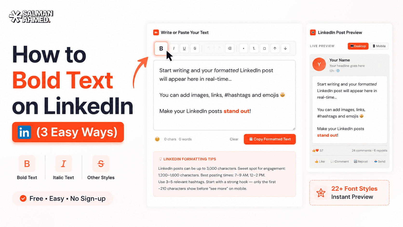
Quick answer: LinkedIn gives you no formatting toolbar — so a post that gets read comes down to structure: a hook line that survives the "…see more" cutoff (~210 characters on mobile), short 1–2 line paragraphs with real whitespace, bold Unicode text for emphasis, lists for scannability, and a clear closing question or CTA. Here's the full playbook, with the exact formatting techniques and limits.
Why Formatting Decides Whether Your Post Gets Read
Hey, I'm Salman — I build websites and free tools, including a LinkedIn text formatter people use to style their posts. And here's what looking at thousands of posts teaches you: on LinkedIn, formatting is not decoration — it's the difference between read and scrolled past.
The feed is an endless wall of identical grey text. Nobody "reads" it; they scan it at speed. A dense paragraph gets skipped no matter how good the idea inside it is. The same idea, broken into short lines with breathing room and one bold hook, stops the scroll. Same words, different fate.
The Anatomy of a Post That Gets Read
1. The hook — your first ~210 characters
LinkedIn truncates posts in the feed with a "…see more" link — after roughly 210 characters on mobile (a bit more on desktop). That means your first one or two lines do ALL the work: nobody clicks "see more" because your fourth paragraph is great. Write the hook as its own line, make it specific, and consider bolding it so it anchors the eye.
2. Short paragraphs & whitespace
One to two lines per paragraph, then a blank line. On a phone — where most of LinkedIn is read — a 4-line paragraph in a word processor becomes an 8-line brick. Whitespace isn't wasted space; it's what makes people feel a post is "quick to read" before they've read a word.
3. Bold text for emphasis (used sparingly)
LinkedIn has no bold button, but Unicode bold text works everywhere — posts, comments, headlines. Bold your hook and the 2–3 phrases that carry the post, and keep everything else plain. I wrote a full guide on how to bold text on LinkedIn, or just use the formatter — type, select, bold, copy, paste.
4. Lists, line-break arrows, and section lines
LinkedIn has no bullet formatting either — but characters do the job: →, •, ✓, or simple dashes. Numbered steps and short bullet runs are the most-scanned parts of any post. In longer posts, a bold single line acts as a section header (LinkedIn has no H2s — bold lines are your H2s).
5. Emojis — as signposts, not confetti
One emoji at the start of a line works like an icon: it gives the eye a coordinate. Ten emojis scattered mid-sentence work like noise. Use them to mark list items or section starts, keep them consistent, and skip them entirely in serious posts — silence is also a tone.
6. Hashtags & the closing CTA
Three to five relevant hashtags at the end (not woven mid-sentence) is plenty. And end with something that invites a response — a question, a "which one are you?", a "disagree?". Comments drive reach more than any formatting trick, so the last line's job is to earn one.
LinkedIn's Formatting Limits — the Numbers That Matter
| Element | Limit | What it means for you |
|---|---|---|
| Post length | 3,000 characters | Room for ~400–500 words — but shorter usually wins |
| Feed preview ("…see more") | ~210 characters (mobile) | Your hook must land inside this window |
| Headline | 220 characters | Unicode styles work here too — keep keywords plain |
| Comment | 1,250 characters | Formatted comments stand out as much as posts |
| Built-in formatting | None | All styling comes from Unicode characters |
Before & After: the Same Post, Formatted
Before — one grey brick, skipped in the feed:
I wanted to share some thoughts about why most business websites fail to generate leads because in my experience after building over 120 websites the problem is almost never the design itself but the structure of the page and where the calls to action are placed and how fast the site loads on mobile devices which most owners never test…
After — same idea, structured to be scanned:
𝗠𝗼𝘀𝘁 𝗯𝘂𝘀𝗶𝗻𝗲𝘀𝘀 𝘄𝗲𝗯𝘀𝗶𝘁𝗲𝘀 𝗱𝗼𝗻'𝘁 𝗳𝗮𝗶𝗹 𝗮𝘁 𝗱𝗲𝘀𝗶𝗴𝗻. 𝗧𝗵𝗲𝘆 𝗳𝗮𝗶𝗹 𝗮𝘁 𝘀𝘁𝗿𝘂𝗰𝘁𝘂𝗿𝗲.
After 120+ builds, the pattern is always the same:
→ CTAs buried below the fold
→ 6-second load times on mobile
→ No reason to act now
Fix those three before touching colors or fonts.
Which one is your site guilty of? 👇
Nothing about the idea changed. The formatting did — and that's the post that earns comments.
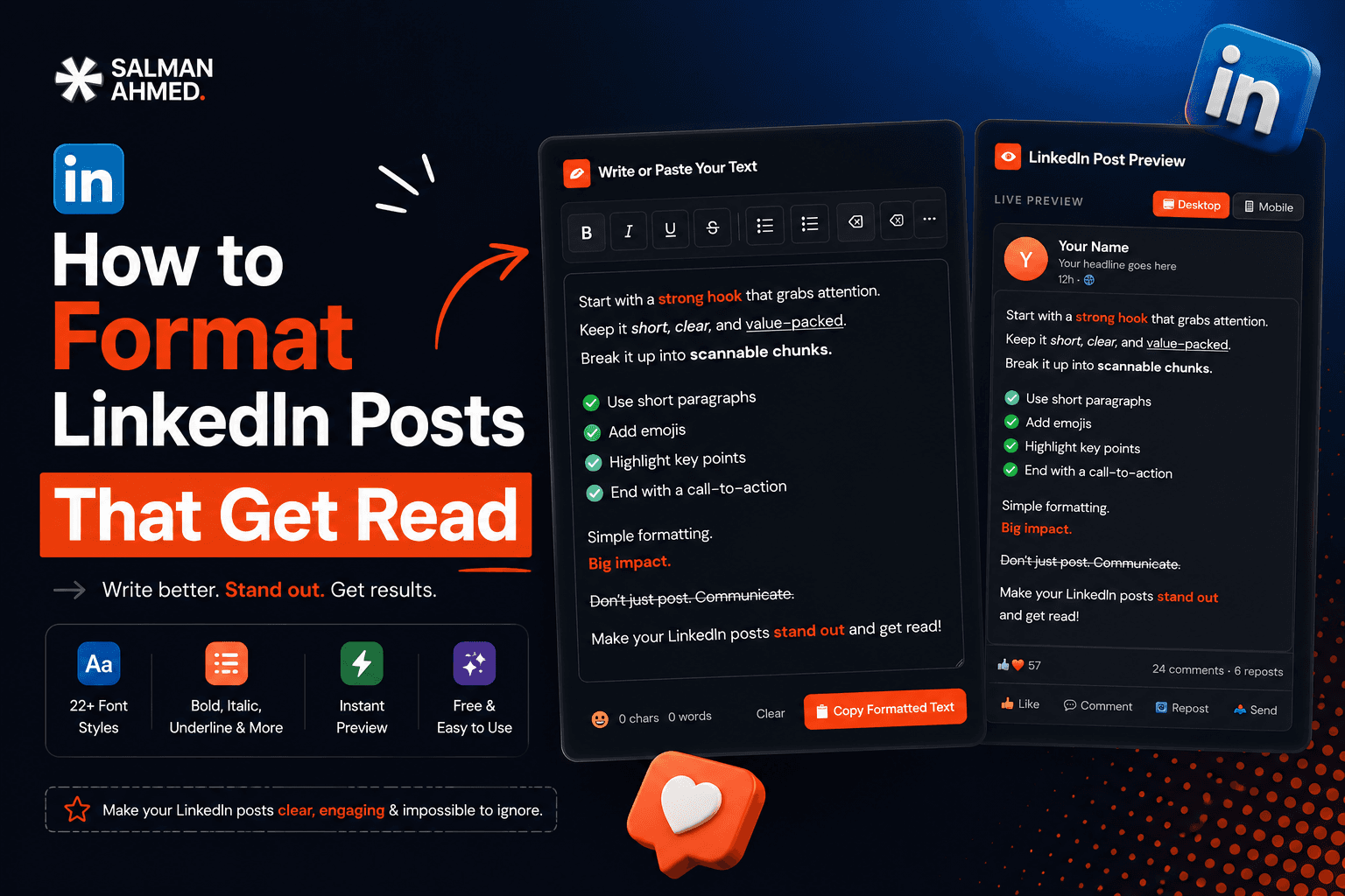
How to Apply All of This in 30 Seconds
- Draft your post in the free LinkedIn formatter — it shows a live feed preview, including where "…see more" will cut.
- Bold the hook and key phrases; add arrows or bullets for your list lines.
- Check the preview on the post and mobile views, copy, and paste into LinkedIn.
No sign-up, works in the browser, and the preview alone will change how you write hooks.